Simplifying Usability in Cancer Diagnosis Medical Devices
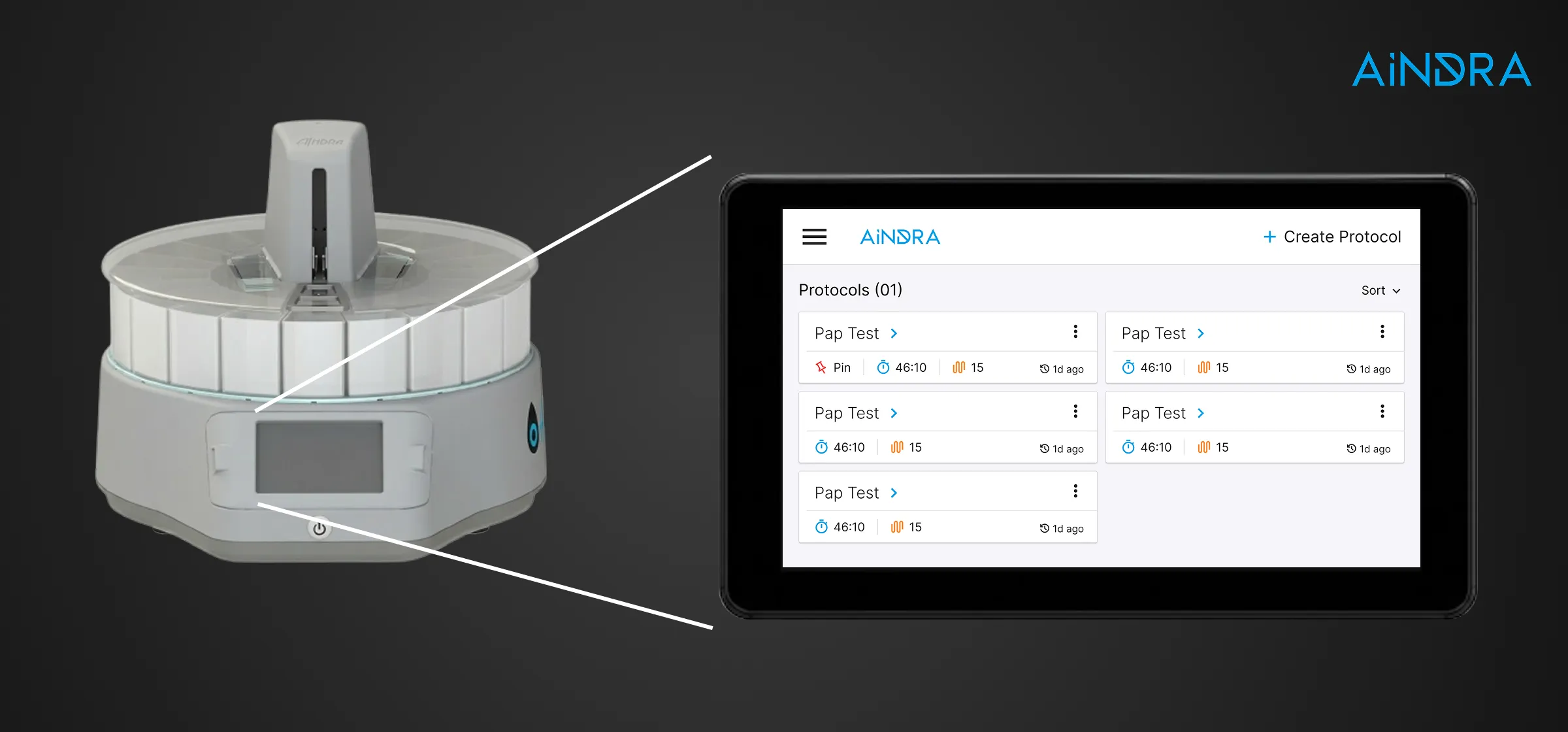
I redesigned the physical device interface for Aindra's autostainer equipment, simplifying multi-step reagent sequences and visual feedback inside an extremely restricted display resolution.
01 // Client & Product Context
Aindra Systems develops advanced medical hardware systems to automate diagnostic operations in laboratories. Their products combine hardware automation and embedded software to standardize procedures like biological sample slide staining and digital micro-imaging.
This standardization allows local pathology laboratories to process diagnostic tests quickly and with consistent quality, regardless of staff experience levels.
02 // Problem Statement
Critical System Obstacle
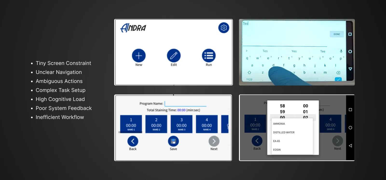
Operating a mechanical slide stainer requires high accuracy. Reagents must be mixed and applied in precise sequences. The legacy interface, constrained by a low-resolution display, suffered from scattered options, technical jargon, and minimal status updates. Consequently, technicians faced high cognitive strain when configuring staining protocols, leading to frequent operator setup errors.
A single configuration error could ruin biological cell samples. Technicians had to spend significant time manually double-checking sequences before starting the staining process.
03 // Design Process
Designing an interface for mechanical medical hardware required detailed workflow research before developing the screen layouts.
Business Core Analysis
Studied Aindra's business model to understand how their devices address efficiency bottlenecks in cancer diagnostics.
Staining Workflow Mapping
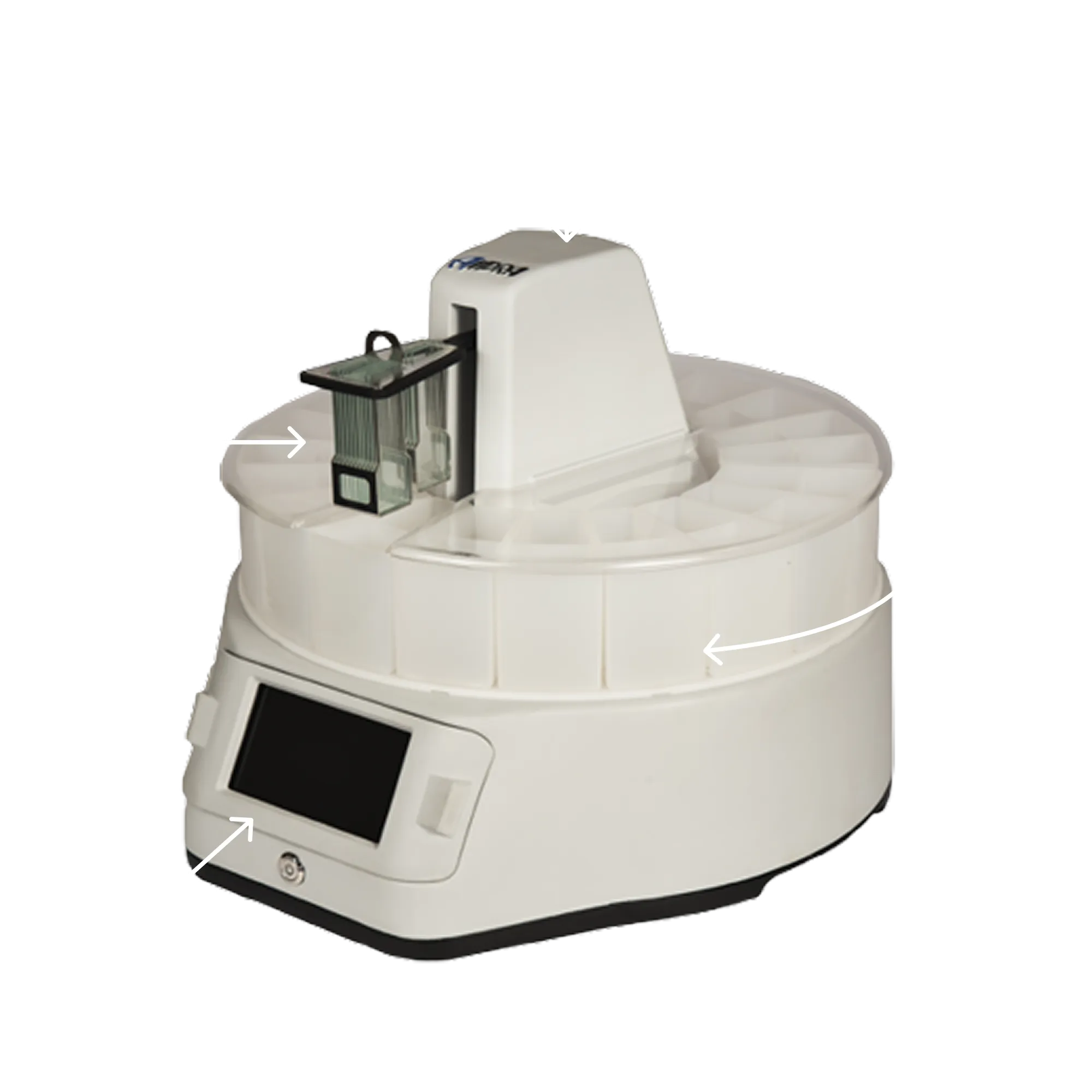
Analyzed the mechanical autostainer mechanics. The physical system moves slide racks through 20+ reagent containers in a precise order. The touchscreen display controls the entire mechanical process.
User & Operator Observations
Observed laboratory technicians operating the stainer to identify usability bottlenecks and friction points during their daily tasks.
Information Architecture Audit
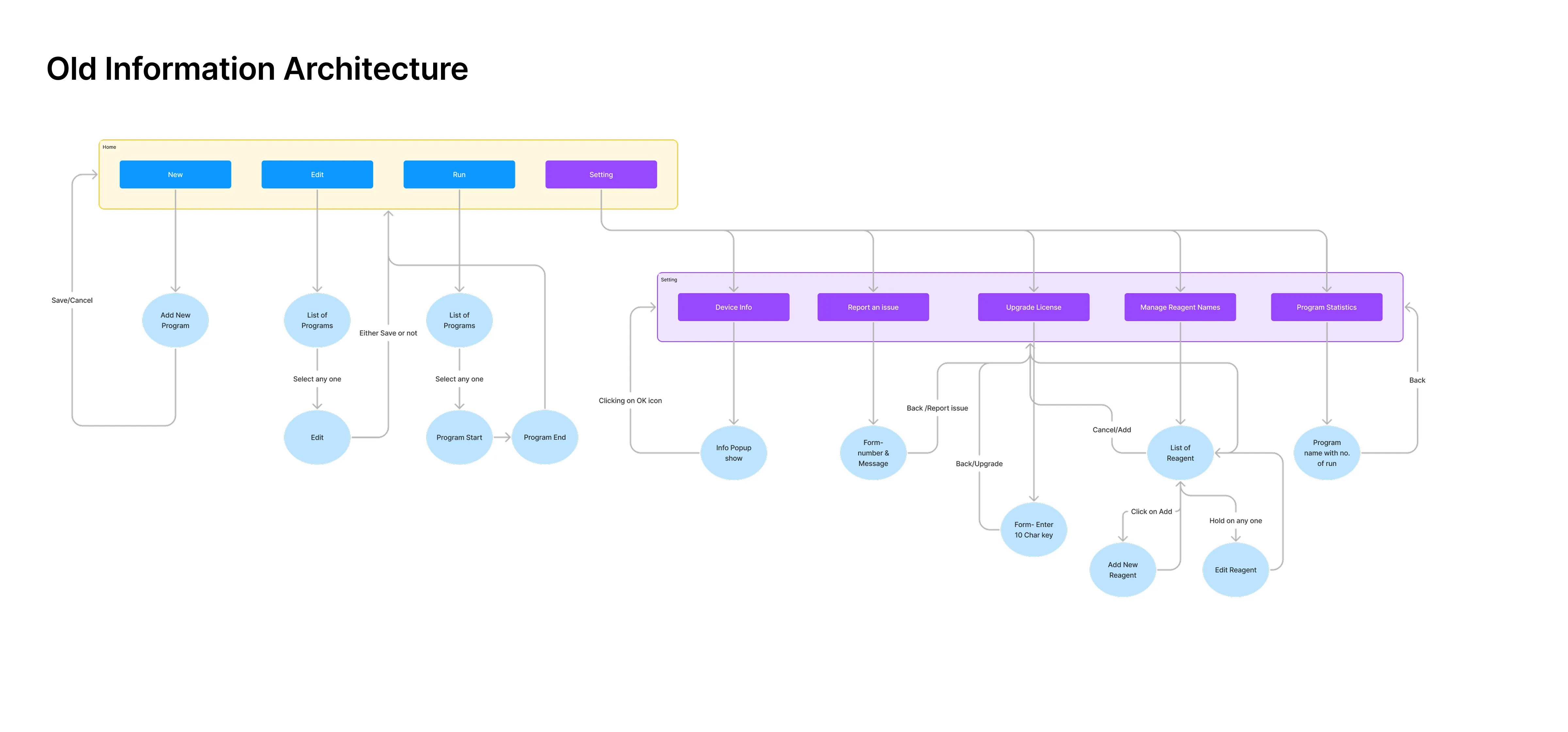
Mapped the legacy system's Information Architecture to locate navigation dead-ends, scattered menus, and confusing pathways. Presented these friction points to the engineering team.
Information Architecture Redesign
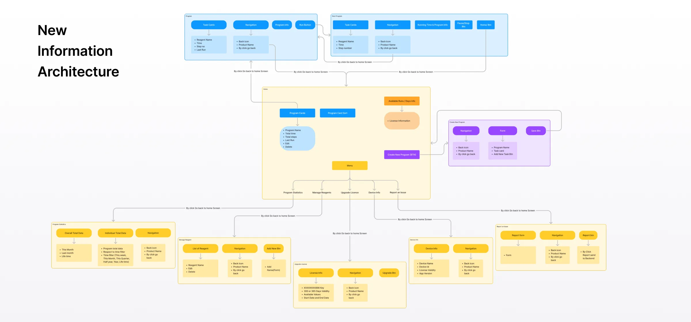
Created a simplified, task-oriented Information Architecture in Figma Jam. Focused on making navigation clearer, grouping related steps, and providing simple status updates.
Wireframing Challenging Screens
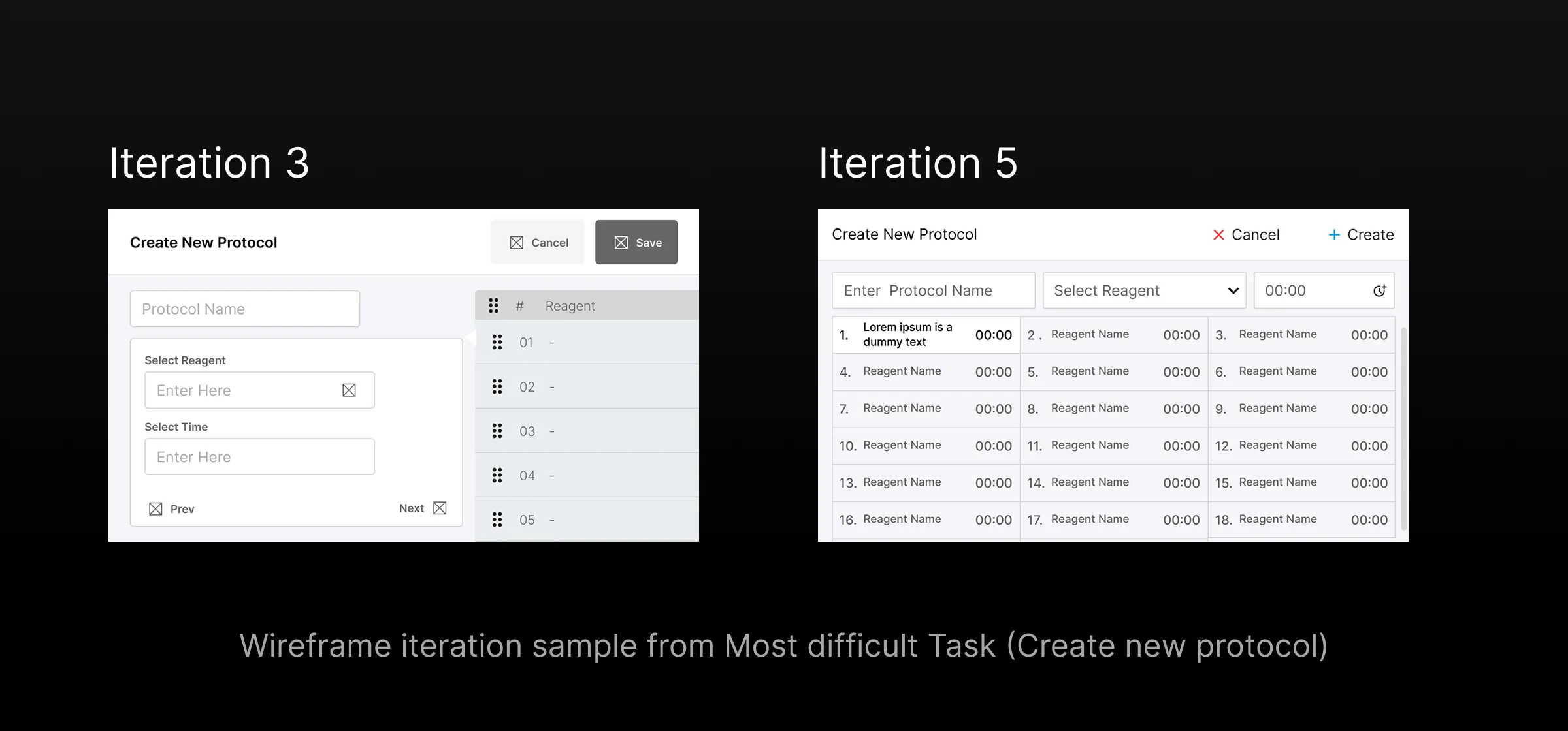
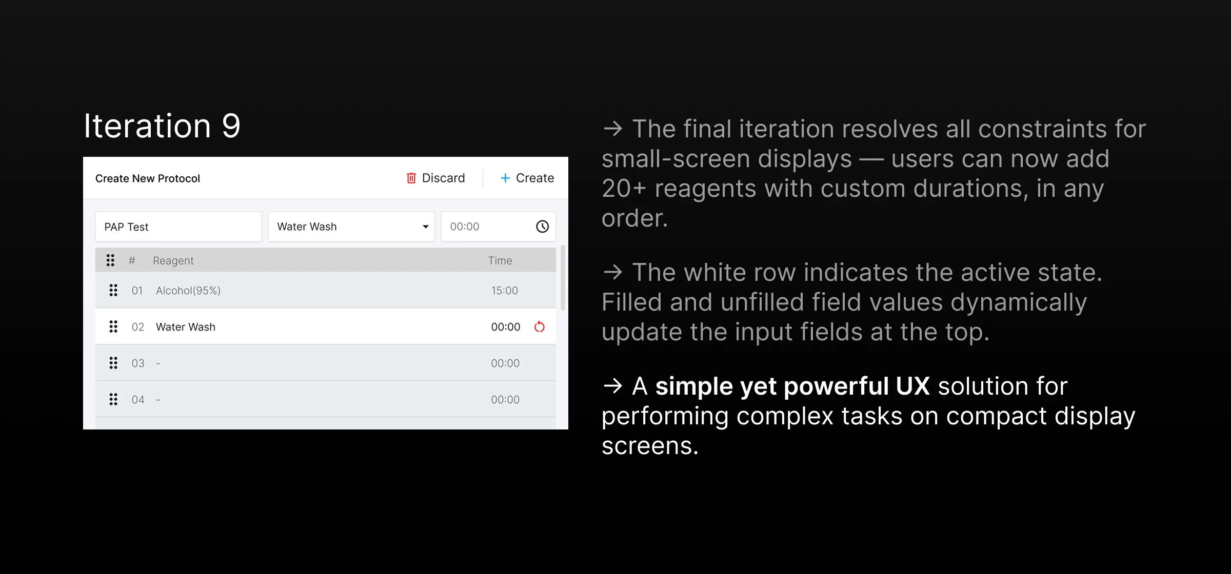
Designed clean UI wireframes, paying special attention to complex tasks like "Create New Protocol" to ensure all parameters fit clearly on the small screen layout.
04 // Outcomes
The redesign simplified how technicians set up and run staining protocols on the device. A clearer structure and unified terminology made the interface more intuitive, reducing setup errors.
The clean layout and clear feedback mechanisms helped lab technicians operate the autostainer with greater efficiency and fewer interruptions.