Loan & Banking App for Non-Technical Industrial Workers
I redesigned the workforce finance application from the ground up to refine complex visual layers, simplify navigation priorities, and improve workflow comprehension for less-educated industrial personnel.
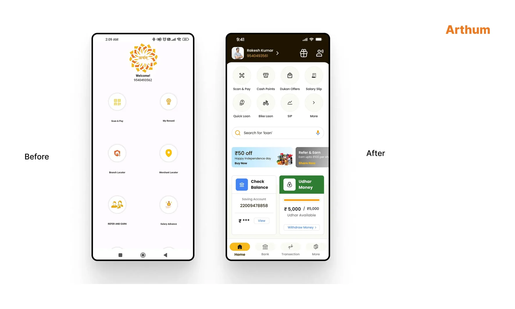
01 // Client Overview
Arthum offers workforce management and localized financial service pipelines for large logistics contractors and industrial groups, such as Hero MotoCorp. The system operates payroll distributions, processes legal advances, and offers direct-to-contractor loan packages.
It bypasses predatory loan middlemen by ensuring compliance, providing digital salary slip credentials, and facilitating secure cash distribution through rural merchant points.
02 // Problem Statement
Critical System Obstacle
The legacy system displayed features in an unprioritized, standard two-column layout. With zero visual hierarchy, related loan services were scattered across different screens, UX copy was heavily technical, and status indicators lacked system confirmation. Consequently, low-literacy industrial workers struggled to navigate options and complete transactions without manual supervision.
This layout created high friction for users and led to high drop-offs in loan applications. Users regularly flooded contractor support channels with basic operational questions.
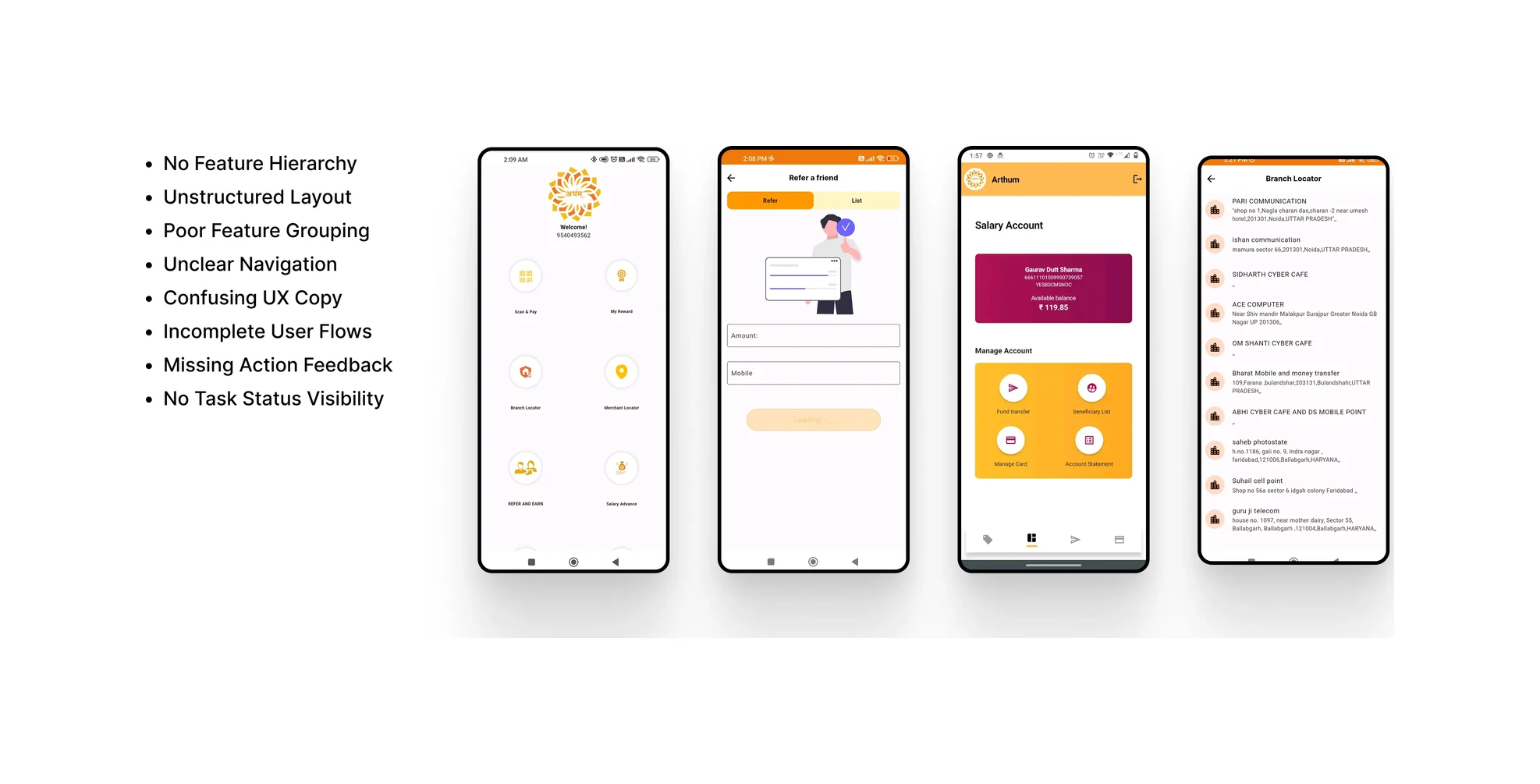
03 // Design Process
Addressing cognitive friction for low-literacy users required a structured, step-by-step approach. I mapped out the interaction details before designing the interface screens.
Feature Mapping & Audit
Audited the legacy system features to map exact data inputs and isolate new features required for the release.
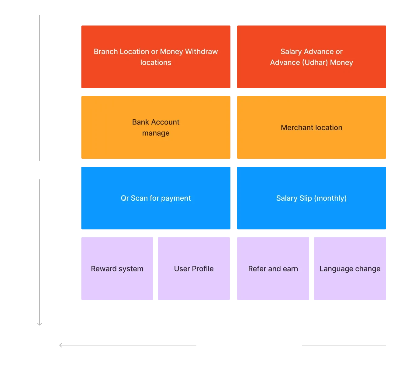
XY Matrix Prioritization
Ranked items using an X-Y priority grid (business value vs. frequency of use) to simplify the homepage structure. Developed clean information hierarchies alongside product managers and stakeholders.
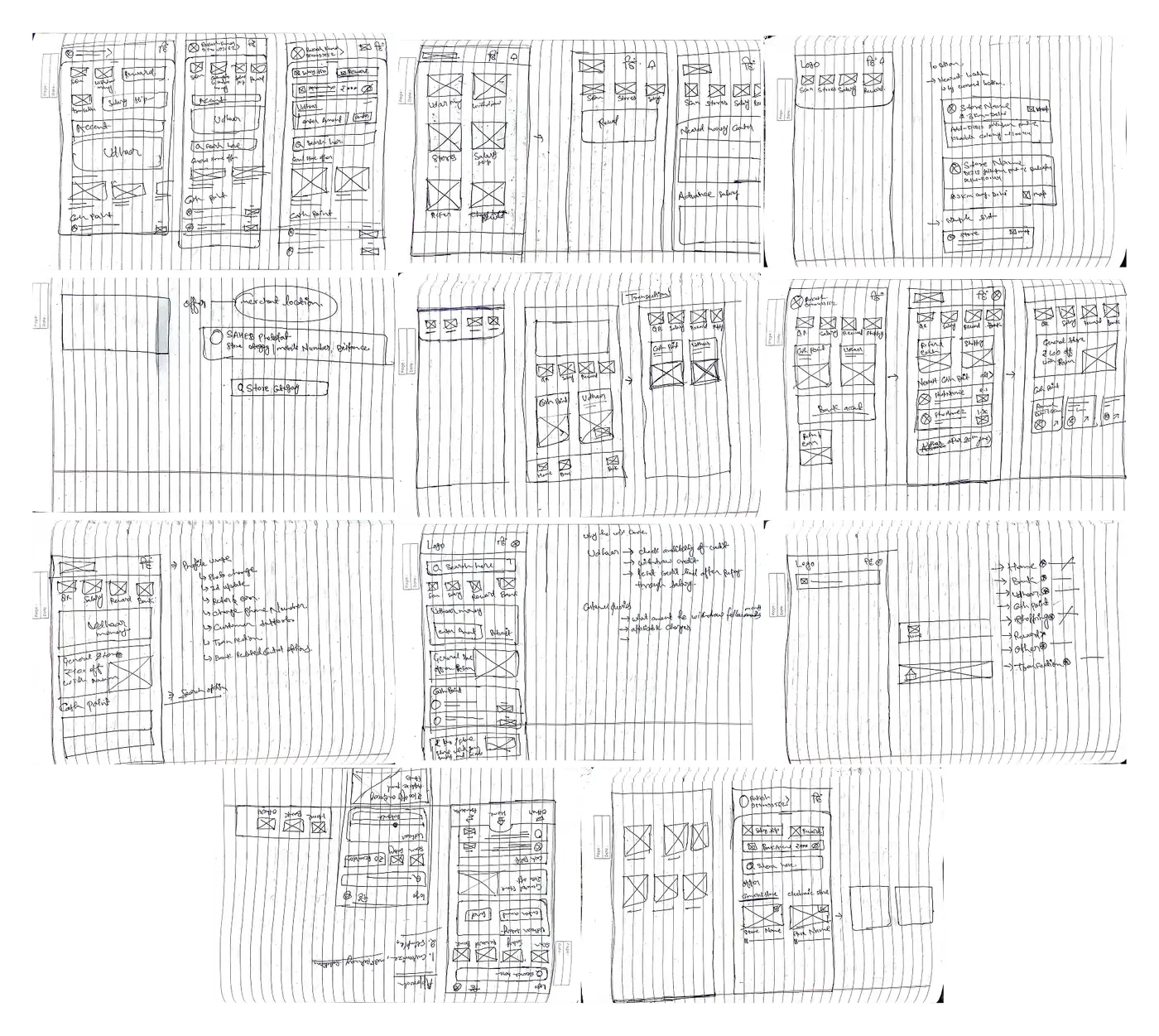
Paper Wireframing & Tokens
Sketched layout variations on paper to explore design directions, then built low-fidelity digital wireframes in Figma. Set up spatial tokens and type definitions to establish consistency early on.
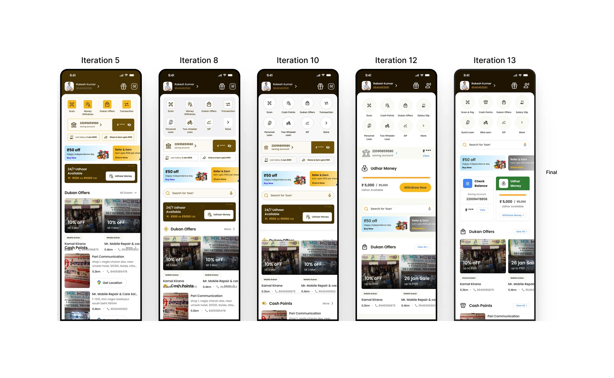
Visual Theme Iterations
Explored two visual directions for the home screen interface. Iterated on components, colors, and layout spacing to establish a clear, accessible, and structured look.
04 // Outcomes
The redesign successfully optimized the mobile banking, advance, transaction, and profile flows. We delivered high-fidelity components, reusable interface tokens, unified icon libraries, and an interactive prototype.
This layout simplification increased mobile transaction completion speeds and significantly reduced basic support queries.