High-Fidelity UI Design for Mamata Healthcare's Doctor & Patient App
I contributed as a UI Designer, taking established UX wireframes and translating them into a rigorous, scannable component system across complex appointment and consultation workflows.
01 // Client & Product Context
Mamata Healthcare is a digital health platform designed to bridge the gap between patients and medical professionals. The platform supports comprehensive healthcare workflows, from initial doctor discovery to booking, tele-consultation, and prescription management.
02 // Problem Statement
Visual Inconsistency & Cognitive Friction
While the UX flow was logically sound, the visual execution across different screens lacked unity. Components handling similar data (e.g., patient details, appointment times) were styled differently depending on the context. This inconsistency hindered scannability, making it difficult for doctors to quickly process critical information between back-to-back consultations.
Without a cohesive design language, the app risked feeling fragmented and untrustworthy to users, slowing down task completion and increasing cognitive load.
03 // UI Refinement Process
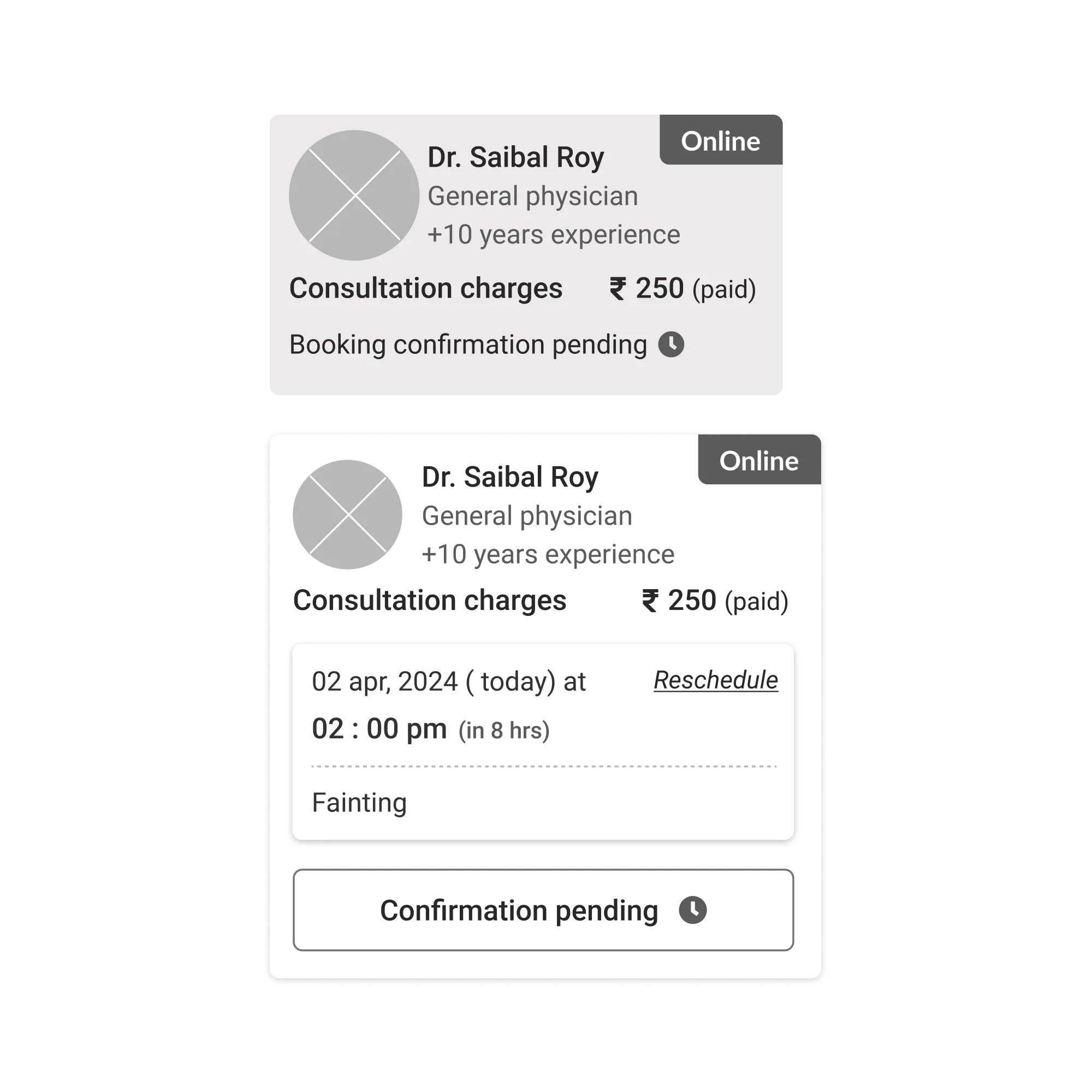
Translating wireframes into a premium UI required a rigorous audit of layout patterns and the establishment of a strict token system.
Comprehensive Wireframe Audit
Reviewed all UX deliverables to understand the complete user journey for both the patient-facing and doctor-facing interfaces.
Component Standardization
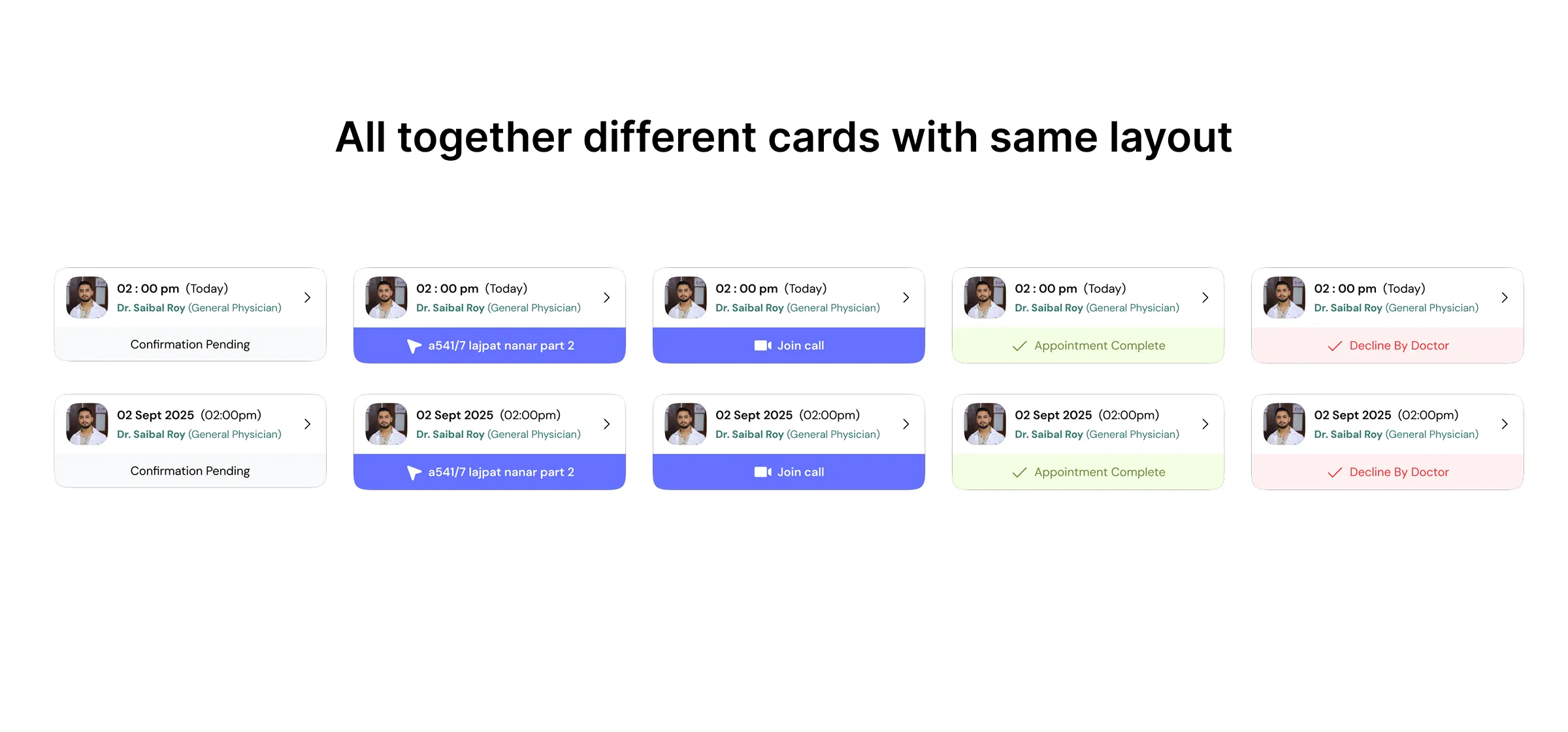
Identified recurring data structures (cards, lists, modals) and standardized their layouts so that key information always appears in predictable locations.
Establishing the Design Language
Developed a unified system of spacing, typography, and color tokens to ensure absolute consistency across the entire application ecosystem.
High-Fidelity Execution
Built the final screens using the new reusable components, delivering polished, development-ready assets that clearly differentiate varying appointment states.
04 // Final UI Renders
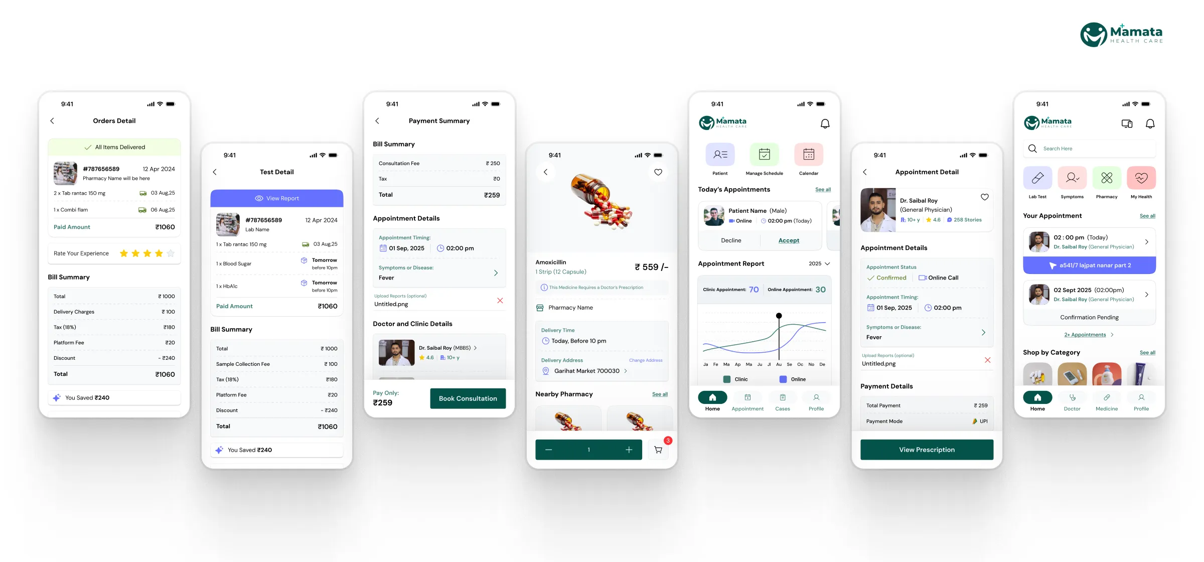
The result was a highly scannable, cohesive interface that adapted seamlessly across patient booking and doctor management scenarios. The standardized components and tokens significantly accelerated subsequent development efforts and ensured a premium, trustworthy feel for end users.